Redesign of the Last Bookstore LA
MY ROLE
UX UI
TOOLS
Sketch, Figma, draw.io, Optimal Workshop
WHO
Just me
DURATION
3 Weeks
Project Overview
As a UX project, I undertook the redesign of The Last Bookstore LA's website, with a particular emphasis on evaluating and enhancing its information architecture (IA), usability, and functionality for desktop users. The objective was to meticulously analyze and optimize the website's structure to better align with the unique business model of the bookstore. The goal was to ensure that the revamped website not only met industry standards but also catered specifically to the needs and objectives of The Last Bookstore LA.
This initiative was carried out independently, without direct collaboration with the business itself.
Research Process
The current Last Bookstore LA website is outdated, lacking the feel of a real store, and navigation is confusing. Through a heuristic analysis, key issues were identified: limited book selection, concerns about website trustworthiness, and the need for enhanced customer reviews. Improvements include intuitive buttons, and user-friendly functionality to create a more engaging and seamless online experience, reminiscent of a welcoming physical bookstore.
Book enthusiast-oriented
Embarking on an immersive research journey, my exploration delved into the realm of book readers worldwide, guided by the passion of literary enthusiasts. This quest unveiled a distinct pathway to enrich my understanding of their deep love for books, preferences in reading and book-buying, and insights into what they appreciate or find challenging when shopping online for their beloved reads.
“Reading to me feels like Antidote for keep living and moving our life, I just love to crack open new book, smell and read it”
“I read books recommended by my mentors or through reviews on social media”
“I like reading books because it gives me knowledge & momentum to go forward whenever I am stuck in life”
So Who IS the book enthusiast?
We aimed to really get to know our users by having important conversations and stepping into their world. From these talks, a clear picture started to form—a character representing the goals, motivations, and behaviors of our diverse user group. This persona became our guide, showing us the way to our common objectives, revealing their specific needs, and sparking creative solutions to their problems.
From Challenge to Resolutions
Ivanna’s persona guided my understanding of the problem context. To address a wider user audience, I broadened the problem statement and formulated "how-might-we" questions. These questions shaped comprehensive solutions for the user flow design.
HMW infuse the online shopping experience with the diverse and welcoming ambiance of local bookstores, fostering a sense of community and exploration?
HMW execute a complete redesign of the website, prioritizing user-centricity and intuition, to minimize friction and elevate the overall browsing and shopping experience?
HMW optimize user-friendly navigation and search functionality, ensuring a seamless and efficient journey for users in discovering their desired books?
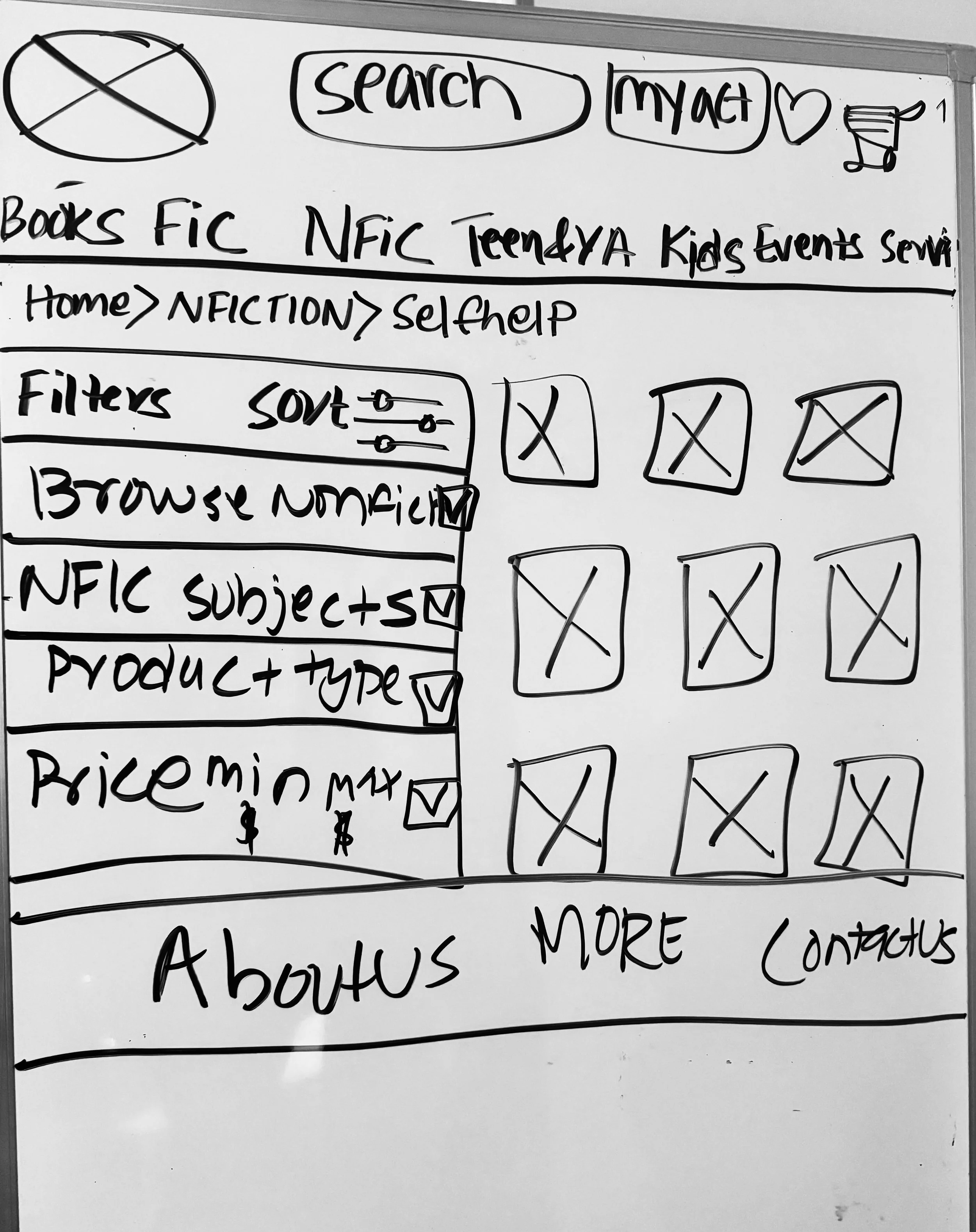
Foundation through Sketches
During the initial brainstorming and sketching phase, our attention was dedicated to crafting the early user flow. The goal was to maintain consistency throughout the flows, ensuring that users could seamlessly complete their tasks without any disruptions.
Usability Test Insights
In usability testing, participants aimed to ease work-related stress by selecting and buying "The Power of Positive Thinking," a nonfiction self-help book from The Last Bookstore website. The updated Figma mid-fidelity prototype garnered positive feedback from both the user and myself for its efficient presentation of information in a simple, digestible interface. Notably, the streamlined browsing flow, encompassing the home, product browsing, product detail, review, and checkout pages, showcased the specific enhancements made. Final testing confirmed the prototype's success in achieving its goals. While participants suggested additional features, they unanimously agreed that the prototype offered a superior flow and interface compared to the initial website.
“It seems smooth to find self-help under Non-fiction so easily, this is much more intuitive and seamless navigation than before”
"Browsing through different categories without constant page redirection made it so much smoother—definitely a more convenient experience!"
“Love how the Review section shows the Reviews and also able to write one.”
Next Steps????
Iterate and Test continuously, progressing towards upgrading the Figma prototype to hi-fidelity version as this prototype was required in mid-Fi only.
Refine each page to maintain a cohesive brand identity.
Extend features, to enhance the website’s capacity for personalization.


